Exclaimer, a leading provider of email signature solutions for businesses, has revealed a renewed brand identity, inspired by the needs of the company’s customers and employees who know the platform best.
In collaboration with brand agency, Koto Studio, the rebrand captures a new look and feel that embodies Exclaimer’s role in the engagement marketing space and gives it a modern feel to reflect where the industry is headed. Branding is at the core of what Exclaimer does, so the company wanted their website and logo to reflect that and resonate with every corner of the marketing industry.
To learn more, we spoke to Carol Howley, CMO at Exclaimer
What was the brief for the rebrand?
Exclaimer is an email signature management platform enabling our customers to centrally manage their email signatures, to showcase their brand effectively and consistently, utilize signatures to promote campaigns, book meetings and share content.
We saw that there was an opportunity to engage with a wider audience beyond IT professionals as the people who really use and see value in the software are marketing, customer success and sales teams.
Our existing brand wasn’t going to support this transformation as it was very formal, functional and was limiting our ability to scale and engage new customers. We wanted to position Exclaimer as a human and personal brand that is trailblazing the way in modern relationship marketing technology. Our brand needed to, effectively and efficiently, drive much needed brand awareness across all touchpoints and support us as we scale.
How did the initial pitch/brainstorming phase go?

Koto Studio, the creative studio behind our rebrand, started with an immersion phase, engaging with key stakeholders to help unpack the brief and deep dive into the brand challenge. We established a project sponsor which was myself and a brand team who were engaged in all meetings and were the ambassadors inside the company to engage with the other teams and ensure they were involved and onboard.
We then worked with our customers, prospects, the senior leadership team and with many within the team to gather input into what the branding needed to look like. This meant that everyone had the chance to share their views and aspirations. The end result truly represents the whole company.
Describe the purpose of the brand and its target audience
We have two audiences that we want to reach, IT and marketing. We securely process emails for over 60,000 organizations every day so we need to position ourselves as trusted and reliable while also demonstrating the value that email signatures can have to brand and marketing efforts, sales, customer success and HR teams.
We want our branding to represent our ability to support both audiences and their specific needs.
What was your thinking behind the rebranding solution?

Our new brand position is around amplifying your email. It's about elevating email signatures and helping companies grow through their email communication by tapping into the power of one-to-one email communication.
Everything we do is reassuringly clear - it's easy to understand. We want to ensure that this clear tone is in everything we do and helps us give customers and prospects a consistent experience across every touchpoint.
Did you learn anything new during the project?
The process of choosing which agency to work with, from how to assess and find a shortlist of agencies, through the pitch process and eventually choosing which one to partner with, was a great learning for me.
We decided to work with Koto Studio because they were the best fit to help us create a contemporary and clean design that reflected our strategy and the direction of the company. We were impressed by their team and felt there was a great synergy between us.
I also learned about the importance of being open to additional perspectives. When we asked everyone to weigh in, it was clear that perceptions and reactions are different between individuals - some are more visually inclined, and some more word focused. We needed to ensure that the new branding appealed to both and navigate the process effectively to bring employees, partners and customers with us on the journey.
What was the biggest challenge? How did you overcome it?

There are many companies within the software space that look similar. If you look at the logos, and their overarching branding, many of the companies start to look alike. So our challenge was to stand out.
Creating something that sparks the interest of a marketing audience was another challenge. These are people who understand the importance of good branding because they are living and breathing it in their own lives. We stayed focused on creating something that was clear and contemporary which reflects our promise to help clients amplify their email.
What kit/tools/software were used to create it?
Koto used a variety of software to create the brand: Figma and Adobe Illustrator were used to design the visual brand and digital experience, Cinema 4D and After Effects for motion and the iPad software Procreate was used to create illustrations. We also used Slack to communicate and collaborate.
What details are you most proud of and why?
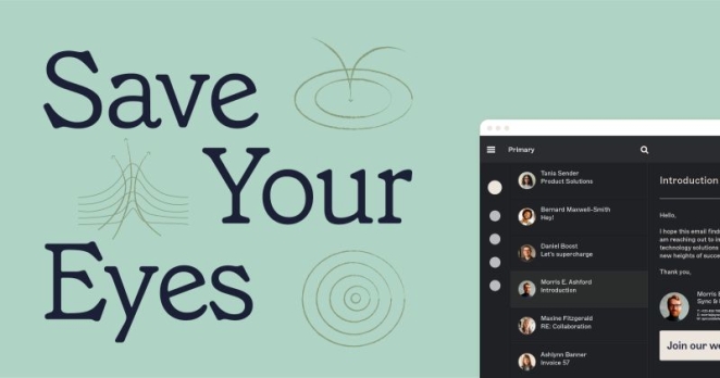
I’m most proud of developing a look and feel that reflects our strategy, it’s beautiful, easy to understand and use, and scalable. Focusing on clear movement and flow genuinely demonstrates the ability to amplify, while the visuals, color palette and tone help us convey our key characteristics - trust, reliability and our understanding of our customers’ goals.
I’m also incredibly proud of the amount of team work that went into this project, both within Exclaimer and with Koto Studio.
What visual influences fuelled your solution?
The logo and the visual mechanic is inspired by the idea of amplification, and focuses on clear movement and soft flow. We spent time studying nature and specific patterns of ripples in water, but also, physics - specifically the patterns of sound waves.
We used a ripple to visualize amplification – an idea which runs through the entire identity, from the new strategic positioning, to the logo, the illustration suite, down to the smallest brand touchpoint.
What do you hope it achieves for the brand?
We hope that the new branding will boost awareness with our customers, prospects, and partners while also being something that people are proud of. We hope that the branding excites people and it makes them see us as a company that they want to work with and for.
What would you do differently if you could do it over again?
For us there was a huge range of learnings in the team that we can apply to other large projects and product launches:
- Engage across the business and bring in nominated team members early in the process.
- Roll out the new branding earlier in the financial year to give people more time to get used to it before they bring it out to the market.
- Appoint a sponsor and project manager early on to help accelerate the roll out.

